We are happy to announce the launch of the new Mlytics logo as part of the ongoing evolution of our company’s brand and to celebrate our 5 year anniversary.
Since our launch in 2017, Mlytics has grown and evolved significantly, and now along with our 5-year anniversary, it is time to refresh our look. We have altered both our logo and brand colors to reflect who we have become today and to symbolize our steady growth towards the future.
We crafted a new logo that breathes life into the key elements of our mission to build towards a safer, faster internet world, featuring choice and control, while at the same time remaining true to our innovative reputation.
Let’s dive deeper into the changes, and the stories behind them
A logo inspired by data
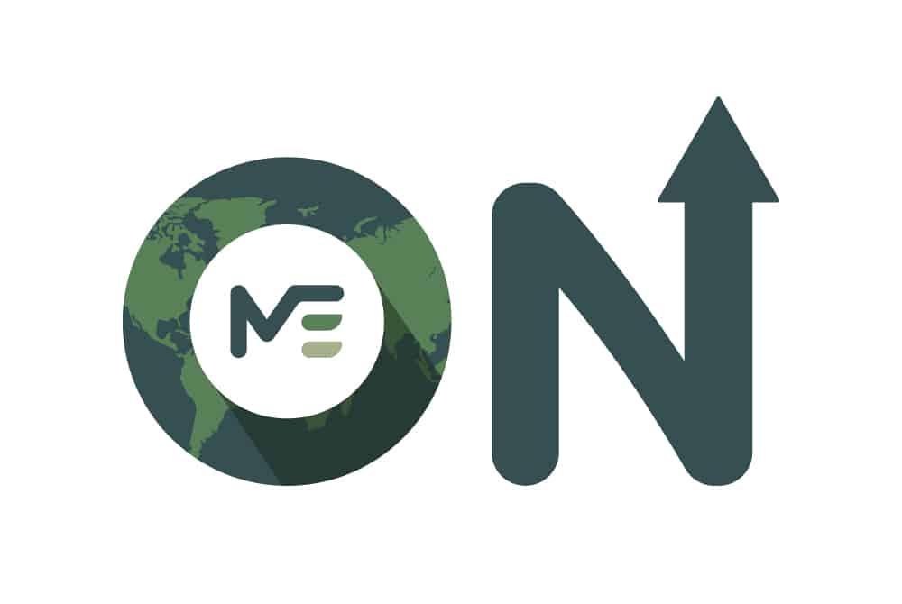
The new logo is a visual representation of the name “Mlytics”, with an “M” on the left side, and bar-chart like features on the right.
“Mlytics” is a combination of “M” and “lytics”. The “M” in Mlytics stands for monitoring, management, marketplace, and machine learning. The “lytics” on the other hand refers to data analytics. Data we collect and share with users to make business-critical decisions.
These two key elements are part of Mlytics solution offering and mission to build a faster, more reliable, and safer online world – while providing the ultimate transparency, flexibility, and customer control.
A perfect color to represent a steady growing ecosystem
The new Mlytics logo is designed around gradients of the color green. Green is a color that stands for growth, vitality and consistency, a symbol that encompasses all generations. It marks our 5-year anniversary and represents the growth Mlytics has experienced along the way, leaving the start-up scene, transforming into an established, innovative platform helping users around the world.
Meanwhile the colors of the new logo symbolize the global interactive ecosystem we are building, not just offering in-house solutions, but also tightly integrating other solution providers.
A logo by, and for the community
After numerous creativity and drawing sessions, we presented a final set of logos to all internal partners, so they could share feedback, voice their opinions and make their vote. This approach reflects our core mission of handing choice and control to our users, in this case employees.
New look for our corporate website
Along with announcing our new brand logo, we have revamped our corporate website too; https://www.mlytics.com. The new site comes in a modern, clean, and organized layout to provide visitors with easy access to our solution information, highlighting our capabilities and solutions in origin security, digital experience monitoring, experience delivery and service orchestrations.
The new logo and website reflect the growth-minded culture of our company and are designed to inspire and further elevate us as we continue to provide content delivery and online security solutions for our current and upcoming clients.
The logo and brand color change will not involve any modifications to the nature or operations of Mlytics as a company, nor will it in any way affect our existing relations with our clients and partners.


